We have seen how colour in the history of bathroom furniture has been very popular. When a customer has a coloured ceramic toilet bowl in his bathroom and goes looking for a toilet cover, he realises how many colours there are and how difficult it is to find the right colour. Today with digital you can do almost anything. Unfortunately, identifying a colour is one of the few things that technology still cannot help us with. A digital image, depending on where it is displayed (each of us tunes the brightness of our mobile phone screens, monitors or tablets to our liking) changes appearance and tone from the original colour. If you look at the same coloured toilet seats on the Sintesibagno website using two different monitors, you will realise that they may look like two different colours. To try to help you in choosing the colour of your toilet seat, we have published some in-depth articles on the subject on the blog. At the following link [ clik here ] you will see the difference between European/normal white and Ideal Standard white at the following link [ clik here ] we help you see the difference between the most popular colours: champagne, mink, kashmir, buckskin and whisky, and finally at the following link [ clik here ] a look at whisper colours (light blue, pink, grey, green) and bright variants of blue, grey, brown and pomegranate. Today we will look at the blues and blues of the old sanitary ware in ceramic houses.
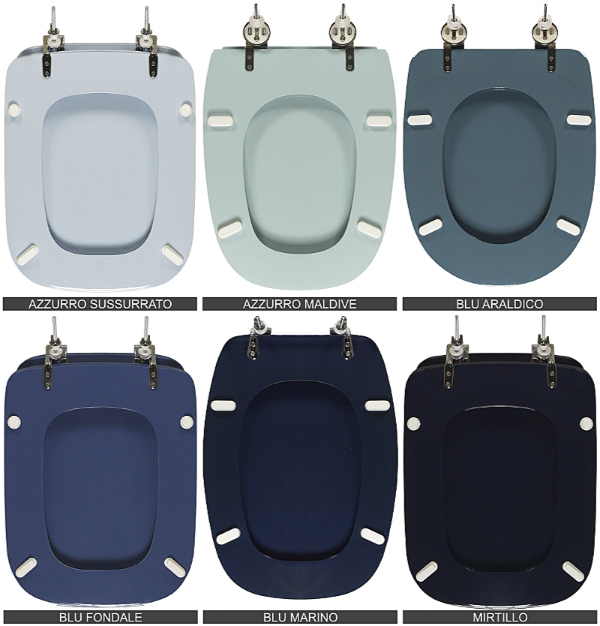
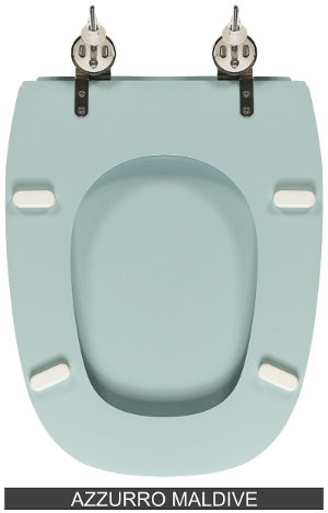
Whisper Blue is a colour that was made known to the general public by ceramic manufacturers Ideal Standard and Pozzi Ginori back in the 1970s and 1980s. It is the typical light blue called confetto. A light blue that for the Ideal Standard ceramic house was the only one presented and proposed on many series that it produced in the 80s and 90s: from the legendary rectangular CONCA series (which we discovered in the post: ), to the oval ELLISSE series and the TESI and LIUTO series. While Pozzi Ginori presented two types of azure, in addition to the whisper blue, also the Maldives blue which is a colour inspired by the ocean where the famous archipelago is located, a blue with a small shade of green that makes it unmistakable. Pozzi Ginori also presented it in several successful series, certainly the first was the well-known SQUARE which we discussed at length in the post: “Pozzi Ginori sanitaryware old square models. Square, Italica and italo duo which toilet seat cover is correct?” and we saw it together with ITALICA and ITALICA DUO.
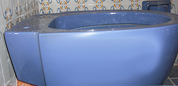
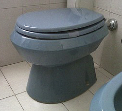
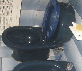
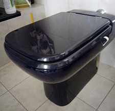
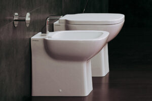
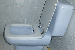
We now come to the end of the blue colour scale, with the two darkest shades: Navy Blue (called by some ceramics, see Cesame , BLU SIAM) and Blueberry. The first is the typical dark blue, the second the blue, which some call night, darkest and designed by the ceramic manufacturer Ideal Standard. The photo opposite shows the Conca vase in this finish. The marine blue was instead a success of Pozzi Ginori and other ceramic manufacturers. In the Sintesibagno store you will find many toilet seats with these colour finishes.


